





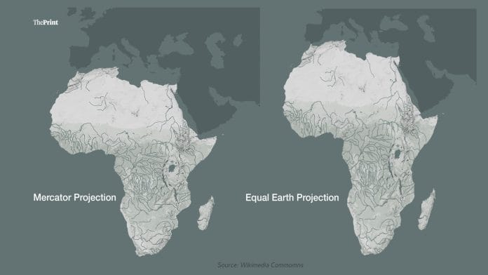

New Delhi: The United Nations General Assembly (UNGA) has voted to adopt a new map of the world, which would depict the size of Africa more comprehensively.
The resolution adopted would formally phase out the Mercator map, which is the most commonly used map globally for a number of centuries.
The UNGA formally retired the Mercator map, first created in the 16th century for the more modern Equal Earth projection. India along with 163 other countries supported the resolution, while the US was the lone country to vote against the resolution.
Though UNGA resolutions are non-binding in nature, the passage of the resolution would likely give a push to ensure more factual maps adopted globally.
“For several centuries, certain cartographic projections that are used in school textbooks, media, digital platforms, and many official documents do not accurately reflect the true extension of our continents,” The resolution pushed by Togo, on behalf of the African Union, argued.
“It has contributed to symbolically minimising the size of Africa as well as other regions, which has created an unbalanced vision of global geography. So this issue goes far beyond just the sphere of map making or cryptography,” Togo Foreign Minister Robert Dussey said Friday, moving the resolution in the UNGA.
“It has to do with cognitive justice, with access to precise geographical knowledge, the dignity of peoples, historic memory, and the fight against representations that we have inherited and have been influenced by perception… Maps shape our understanding of the world. They guide education, nourish the imagination and influence collective perceptions.”
Explaining its vote against the resolution, the US argued that the resolution “mocks the work and purpose of this institution”. Its statement added that the effort, while being presented as an “anodyne effort to update cartographic proportions,” Washington views it part of a “larger and more radical ideological project”.
“Resolutions like this one and the ideological agenda they promote…and the reason this institution is losing its credibility. When the UN questions why it is losing legitimacy in the world and is not taken seriously time and again, we point to resolutions such as this.”
The American opposition is in line with President Donald Trump’s stated world-view. Under his administration, the US has focused on retooling its own maps, by declaring the Gulf of Mexico as the ‘Gulf of America’ and renaming Lake Ontario to ‘Lake America’.
The US’ own role in trying to establish its own maps, points to the larger question – what is in a map?
The debate over the Mercator map is not new. In 2011, American television show The West Wing had a three-minute segment with individuals representing the “Organisation of Cartographers for Social Equality,” who made a pitch to C.J. Cregg and Josh Lyman – main characters in the show – the move from the Mercator projection to a more accurate “Peters projection.”
“The Mercator projection has fostered European imperialist attitudes for centuries, and created an ethnic bias against the third world,” one of the characters explained as a reason for changing the map.
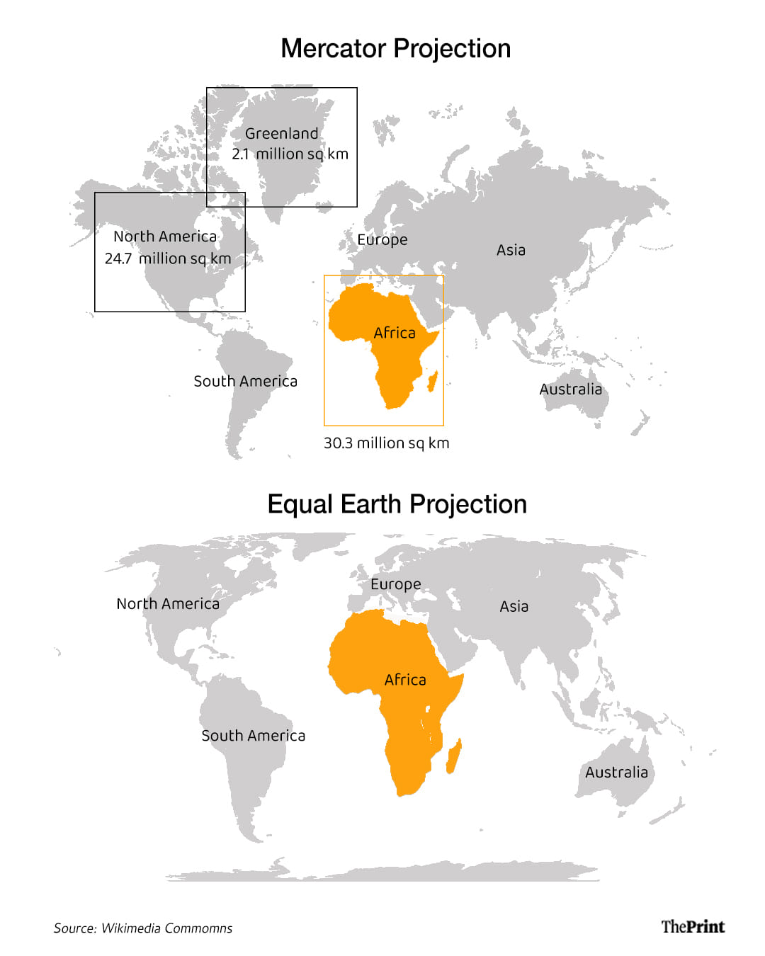
The scene shifts to the size distortions offered by the Mercator map: Greenland is shown as almost the relative size of Africa, despite the Danish territory being 14 times smaller than the continent. Europe is shown roughly the same size of South America, despite being almost half its size.
So what is in a map?
The most commonly used map, especially the one found in atlases or in classrooms, is one created in 1569 by Gerardus Mercator. Born in modern-day Flanders (Belgium), Mercator used his skills as a cartographer to depict the globe into a flattened two-dimensional image.
The map was primarily designed to help sailors navigate the world. The world was divided into straight longitudinal and latitudinal lines, which would allow sailors to plot an almost state route through the seas. The latitude and longitude lines intersected at 90-degree angles.
Meant to primarily aid in navigation, the map did not depict the true sizes of land-masses. Mercator made many compromises to ensure ease of navigation, including curtailing the sizes of countries closer to the equator, while enlarging those in the northern hemisphere.
At higher latitudes, countries appear larger than they truly are. The Mercator map became more common as centuries passed, and is considered the more visibly seen representation of the world. Mercator is also the individual to coin the term “atlas” to represent a compendium of maps.
The online campaign group #CorrectTheMap points out in its resources that “for over 450 years, we have based our understanding of Africa, and the world, on a map that is wrong! In fact, you could fit the US, China, India, Japan, Mexico and much of Europe into Africa and still have land to spare.”
“The Mercator map isn’t just about misrepresenting the size of the global South — it’s about power and perception.”
The Mercator map not only distorts the size of Africa and South America. Almost a decade ago in 2018, the then Prime Minister of New Zealand Jacinda Ardern participated in a campaign for the tourism department, which revolved around the island country being left off maps.
The rather comedic skit, however, points out to the issue surrounding the Mercator map, which places the Greenwich latitude almost always at the centre of the map, as it is the prime meridian (zero degrees longitude).
The Equal Earth projection comes in different forms, which could allow the countries in Oceania to be the centre of the map for example.
France has come out in support of phasing out the Mercator projection. French foreign minister Jean-Noël Barrot announced Friday that his ministry will stop using the Mercator map. Barrot in a statement on X said that “no map is ever entirely neutral. On the Mercator projection, Greenland appears almost as vast as Africa, whereas Africa is in reality about fourteen times larger.”
“Distortions eventually become embedded in perceptions. The time has come to correct them. This is why the Ministry for Europe and Foreign Affairs is abandoning this distorting projection in favor of maps that are more faithful to actual surface areas, and that comply with the recommendations of cartographers and scientists,” Barrot posted on X.
Resolution urges fairer representation in tech
Map software has proliferated in the last few years, with the growth of smartphones globally. One of the more common applications – Google Maps – for example has roughly two billion users monthly.
Similarly Apple Maps is estimated to have more than 500 million users monthly, even though the American tech company does not share such data publicly. Both these tech giants use a form of the Mercator projection, specifically the “Web Mercator Projection” to aid in navigation for users.
The Web Mercator map is ideal as it preserves the ability of ninety degree angles, making it useful for turn-by-turn navigation. More commonly in India, such navigational tools are seen across taxi platforms.
“Urges global technology platforms to engage in constructive dialogue with Member States and regional organizations with a view to promoting more accurate cartographic representations, including the Equal Earth cartographic projection of the globe, according to UN principles, standards and guidelines,” the resolution passed by the UNGA said.
“Invites technology companies and digital actors, as appropriate, to promote transparent and inclusive practices in the representation of continental sizes, taking into account applicable UN principles, standards and guidelines and international law.”
Does the Equal Earth Projection redraw boundaries?
In short, no. The resolution, firstly, is non-binding in nature. The resolution focuses on encouraging more scientific approaches to represent landmass, while not entering into the political debates of national boundaries. While the French foreign ministry announced its adoption, it is up to individual countries to follow suit as per their own mandates.
India and Pakistan remain locked in a dispute over the fate of Jammu and Kashmir. Pakistan continues to illegally occupy parts of the Indian union territory. Explaining its vote at the UNGA, India highlighted that it does not specifically support the “Equal Earth Projection” but rather efforts of “Equal Area Projections.”
“Equal Area projections are particularly relevant because they preserve the relative sizes or areas of continental and territorial land masses. This can help address distortions in perceived land mass size that arise from projections designed primarily to preserve other geographic characteristics, such as shape, direction, or distance,” the Indian diplomat said Friday.
“At the same time, different projections serve different cartographic purposes. No single projection is necessarily appropriate for every application.”
The Indian delegation, the representative said, supports the language that encourages accurate cartographic representation while allowing countries, institutions, and cartographers to determine which projection is most appropriate for their specific needs.
Pakistan’s representative highlighted that Islamabad voted in favour of the resolution as it does “alter the legal status of disputed territories,” further highlighting the nature of potential disagreements to the resolution.
While the US considered the project as a part of a “radical agenda,” six other countries abstained from the vote. The countries were Ukraine, Serbia, Estonia, Lithuania, Georgia, and Moldova.
Serbia, Georgia and Moldova all have territorial disputes. Kosovo, for example, has attempted to secede from Serbia, and is currently recognised by over 100 nations globally. India does not recognise its independence. Kosovo is not a part of the UN either. Similarly, Georgia and Moldova have frozen border conflicts, following the collapse of the Soviet Union in the early 1990s.
(Edited by Tony Rai)
Also Read: From China to X: Chinese academics enter India’s foreign policy debate pushing Beijing’s view