
")
Warning: this Readers’ Editor piece is going to be very graphic.
By that I don’t mean I am about to draw you lurid pictures, so don’t cover your eyes. Instead, I will try to tell you in words what a Soham, Ramandeep, Manisha or a Prajna say in illustrations.
These graphics artists at ThePrint illustrate stories; but their work also conveys mood and shades of meaning, a text or a photograph can’t always quite grasp.
A graphic, an illustration, a chart, a table is a simple, direct visual communication that says it all in a trice. By just looking at them you ought to know the subject at hand. And when combined with photographs, they can light up the screen, literally.
Of course, they become obtrusive and overwhelm the written word when they’re too loud, or confusing when they’re too detailed.
But what they can say in one frame, I am struggling to convey in about 200 words, so let me share an example:
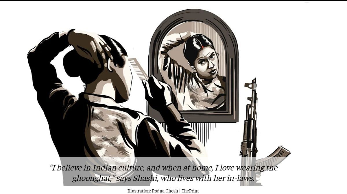
Sindoor, bindi, AK 47—and intimate look at CRPF women’s lives in J&K, Chhattisgarh and Manipur (30 April 2023) is a fine piece of ground reporting by Manisha Mondal and Urjita Bharadwaj, amplified and enriched by Senior Graphics Journalist Soham Sen and Illustrator Prajna Ghosh who designed and illustrated the story.
Scroll through it and you will agree that the photographs, along with the illustrations, data visualisation and the heat map (such a delightful description!) reveal, at a glance, what the words describe: “Donning chutki-bhar sindoor, a tiny red bindi, and strapping a 3-kg AK-47 on her right shoulder, Shashi ties her long, black damp hair with two rubber bands. With a final look in the mirror, she heads out to perform a drill in Srinagar.”
Sen says they tried to get to the heart of the matter: “The axis of the story was the duality of the women’s lives and we’ve tried to show you that. This is what I want to do – help you to enter the story, give you an immersive experience, if possible, a 360-degree understanding of the ground report.”
Also read: Podcasts, video analysis, on-ground clips—ThePrint is ready for the age of ‘viewer-reader’
Supporting the newsroom
A caveat here: this piece is about what could be called graphics journalism, not graphics art – although I think much of it is a work of art as well.
How exactly does graphics journalism support the newsroom? Let me count the ways:
Up to 20 stories land daily at the graphics table needing illustrations, info-graphics, reworked photographs, cut-outs, collages, data formatted. There are reports, opinion pieces, reviews – anything written at ThePrint might need a graphics.
The video team needs support with signature background designs, thumbnails, visual cues, promos for the shows — each one distinctive to convey the subject of the video and… Oh, hang on a minute, the marketing team wants an illustration for its adverts or alerts — and have you designed that PPT that needs to be put out, immediately?
Also read: Lights, camera, storytelling—how ThePrint photojournalists tell news and win awards
The deadline and other challenges
Sen has been at ThePrint for five years and believes that his job is to “briefly and simply… add depth to words…”
Senior Illustrator Ramandeep Kaur agrees with him. “We have to support the story, in visually appealing ways that effectively give readers information,” she says. “I like to keep things minimal with clean lines and shapes.”
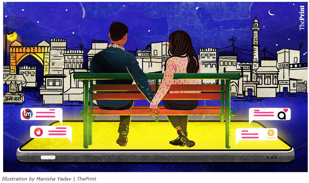
For Manisha Yadav, the most experienced of the team, painting is her first love and ambition. And you can see the painter’s touch in some of her work at ThePrint: this illustration just needs a frame and a hook to hang it on a wall.
It doesn’t always go as planned. “The four of us, ideate together—we help each other out a lot — but sometimes because of tight news deadlines, not all are implemented,” she says.
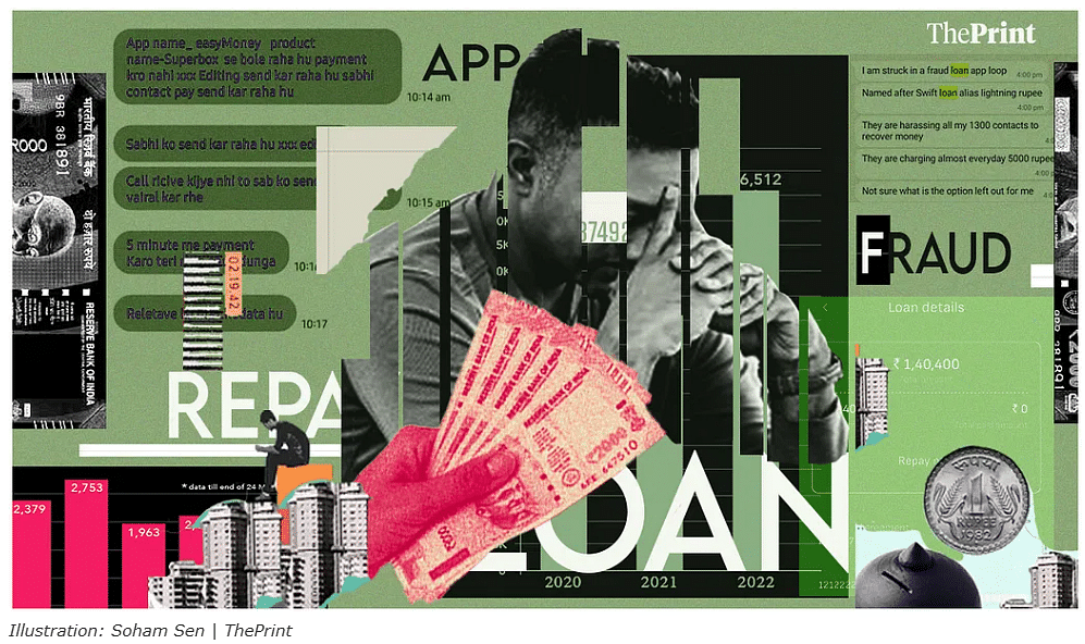
Also, it isn’t always easy to create a suitable illustration: Yadav mentioned a story about bank loan app scams — “How to illustrate that?” Well, this is how it was eventually illustrated:
She agrees with Sen that you have to identify the “axis” or the “peg” of the story and push that to the centre of the illustration.
“Your work cannot be opinionated, biased or a figment of your imagination — it has to convey the piece,” adds Ghosh. “You have to package a story to attract readers.”
But what if it’s about a violent crime or sexual harassment —how do you ‘package’ that? There are limitations. “No finger pointing, and you don’t show blood, or murders,” says Sen. “Also, you have to faithfully represent people of different regions or religions, you have to cap your imagination.”
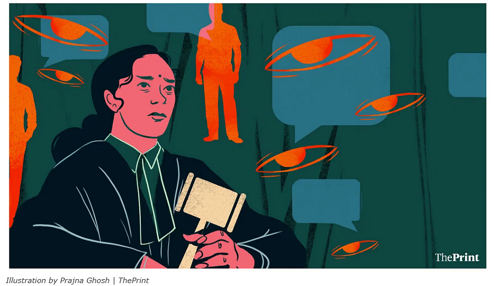
After a lot of soul-scratching, Ghosh came up with this idea for a Jyoti Yadav series on the harassment of two women judges.
She also finds it challenging to illustrate economy pieces – “You can’t show just money notes each time, you have to create a unique idea …”
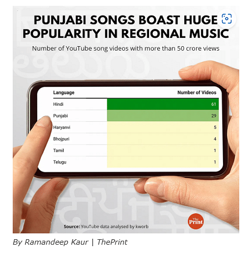
The most time-consuming exercises are the data info-graphics. “You have to make the numbers speak, the visual appealing,” says Kaur. Here is an example of what she means:
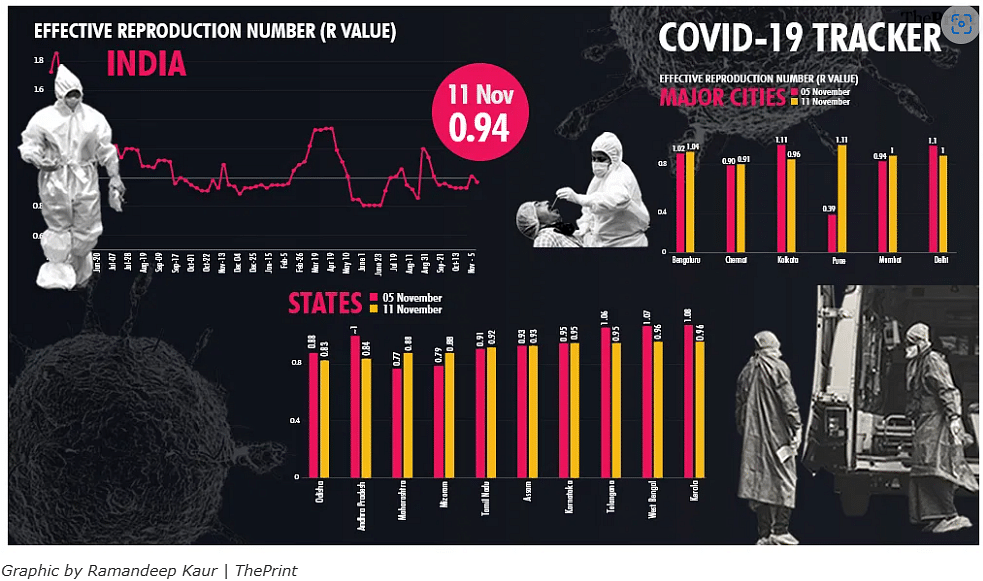
The other mind-bender was ThePrint’s coronavirus coverage – other than its compelling ground reports, there was a data update throughout the day.
Also read: Critical analysis by ThePrint readers always welcome, but we won’t send a spy to Pakistan
The visual tools at play
“Covid was a game changer for me,” says Sen, “The most difficult but fruitful time.” Before Kaur signed up, Sen was the sole graphics artist at ThePrint: “I used to sleep with the laptop,” he remembers, “I had to constantly change the data graphs.”
Kaur who joined in 2020, agrees: “I learnt a lot during Covid,” she says, adding that to keep the ‘Covid tracker’ ticking was a daily challenge.
“It was like a two-year long election results day,” says Sen. On results day, most newsrooms are a ‘crazy’ place to be and ThePrint is no different.
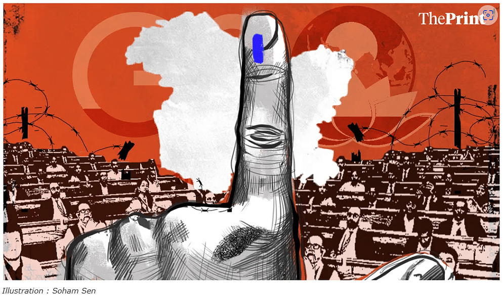
Election day work requires considerable ingenuity. As Sen says, the audience is attuned to a certain format for poll results and any “radical change” in the presentation may confuse them. “But nobody wants to go through hundreds of tables with numbers, either,” he adds. That’s where heat maps come in and, hopefully, we will see more of them for the forthcoming assembly elections this winter and the Lok Sabha polls next summer.
Also read: ThePrint Ground Reports go beyond breaking news, tell stories that are being buried
What glues them together
When I asked these four graphics artists whether their creativity derives satisfaction in journalism, I learnt that they share a common interest in current affairs. For Ghosh, the anti-CAA protests were a turning point, Yadav is interested in history, geography, Kaur discovered a “liking” for ThePrint’s journalism before she joined while Sen had studied to join broadcast journalism before he fell for graphics.
He says, “I find politics the most happening,” which is why perhaps, he has illustrated Editor-in-Chief, Shekhar Gupta’s ‘National Interest’ column each week, since the summer of 2018. “It’s the most important column at ThePrint and I have to represent the idea, the sentiment simply not as an abstract,” he says. It takes him all of Friday night and early Saturday morning to achieve his ambition. “Sometimes, I work till 7 am!” he adds.
Look at his illustrations for ‘National Interest’ and then look at the work done for other stories at ThePrint – you will notice there is, as Yadav says, “a colour palette and style” to our graphics. It’s difficult to describe in words, so I won’t attempt it: see for yourselves. You may or may not always appreciate or like a particular illustration, but it ought to have ThePrint’s stamp on it.
“There is of course a style sheet, but what I like is that you can experiment,” says Ghosh. Yadav likes story-telling and finds there is enough space for her to try her hand at that.
That ThePrint has a graphics department with four artists tells you how important this component is to its editorial vision — no other online news website matches ThePrint in this aspect.
This is something to acknowledge with the hope that in the future, ThePrint becomes more and more graphic.
Shailaja Bajpai is ThePrint’s Readers’ Editor. Please write in with your views, complaints to readers.editor@theprint.in
(Edited by Anurag Chaubey)