


During this global pandemic, several nations across different geographical regions, have had the accuracy of their Covid-19 data records looked at with a healthy dose of questioning. For instance, even with the best of intentions, some western nations have had difficulties in classifying their Covid-19 data. This does not necessarily imply deliberate misrepresentation of the data on part of the agencies responsible. It is just that a pandemic that has left the world shaken in so many ways will also, doubtless, affect data keeping. At the same time, when it comes to data records, it is of utmost importance to endeavour towards maintaining accuracy to the extent possible.
In such a situation, it is useful to try and gauge the accuracy or reliability of the data through various methods. One such fairly reliable means of measuring the accuracy of numeric data sets is a simple mathematical law that was discovered many decades ago and is generally known as the Benford’s Law. This easy to state and just as easy to understand law deals with gauging the reliability or accuracy of large data sets consisting of numeric data that has occurred in natural or non-artificial ways. In other words, the data set must consist of plenty of numbers and these numbers should have arisen without deliberate interference or manipulation. It is generally accepted that the law is meaningfully applicable in instances where the number of data points is at least 500. Also, the meaning of ‘naturally occurring data’ is best understood through illustrations such as of the type related to stock markets or tax records or population data.
Benford’s Law and its application
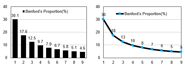
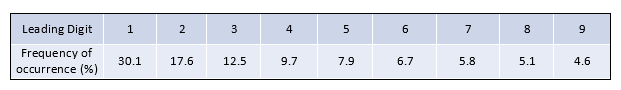
The law was discovered, actually rediscovered, by Charles Benford in 1938. To grasp this simple law, we need to understand the meaning of the term ‘leading digit’. Given any number, say 813, its leading or first digit is 8. Obviously, we can have only 9 leading digits in any combination viz. 1, 2, 3, 4, 5, 6, 7, 8 and 9. The law says that given a naturally arising collection of very, many numbers, the number of times each leading digit occurs as a percentage of the entire lot of leading digits is fixed. In other words, in the entire collection of leading digits arising from a naturally occurring collection of numbers associated with a phenomenon, the number 1 must occur about 30 per cent of the time; the digit 2 about 17 per cent of the time and so on in a certain decreasing order for the other 7 digits where 9 occurs 4.6 per cent of the time. Hence, if the data is true then in about 1000 numbers, 1 occurs as a leading digit about 300 times and so on. This is best illustrated through the following precisely stated table and also pictorially by the succeeding graphs.
What happens when in a given data set of leading digits, arising from numbers denoting a natural phenomenon, is not in conformity with the law? The answer is simple; there is a very high chance that the data is not reliable either because of inaccurate records or because of manipulation.
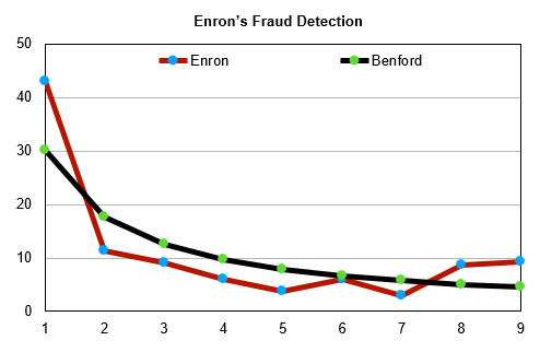
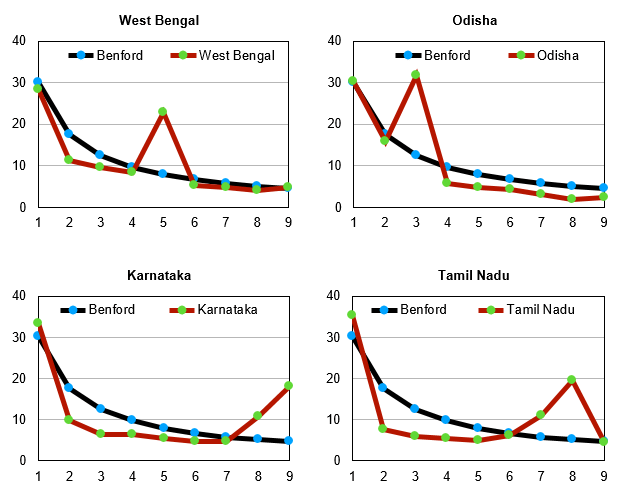
One of the best ways to contrast the actual data against that prescribed by Benford’s Law is visually, through a graph. That is precisely what we shall be doing for all figures in the article. We shall superimpose the curve given by the actual data (always in red) over the standard curve prescribed by Benford’s Law (always in black). The Benford curve shall look like a slide descending from the right to the left. The deviations of the curve representing the actual data vis a vis the Benford’s curve shall reveal unreliability of the data set.
The prowess of the law is best gauged by a look at the financial data of the now defunct former energy giant Enron Corporation. It is now well known that Enron had been fudging its financial data. This can be seen in the figure below where the data curve for Enron’s revenues is a very bad fit over the Benford curve. It is actually a no brainer to infer that Enron had heavily manipulated its financial data as can be seen by the number of significant deviations of the Enron data curve from the standard Benford curve.
Also read: Covid can’t touch us, say protesting Haryana farmers, but toll in villages tells another story
Testing Covid data
We have in this article attempted to look at the data arising from Covid-19 cases across countries and across several states of India. Some very interesting insights emerge.
For instance, the global data for Covid-19 daily infections is fairly reliable as it fits Benford’s curve quite nicely.
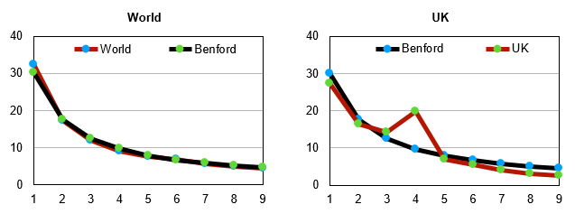
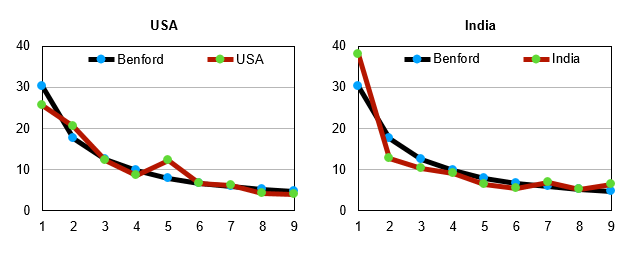
Each of the two graphs (immediately above, clockwise second and fourth) represent the combined data for deaths and infections. The second graph represents UK data and the fourth one gives us US data. Both these graphs are in reasonable conformity with Benford’s curve. The US data seems to be a notch more reliable. Interestingly, the data for the for the UK has some issues since the digit 4 occurs as leading digit far more often than prescribed by the Benford curve. But in general, it is a good fit.
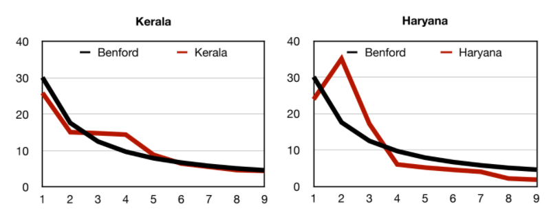
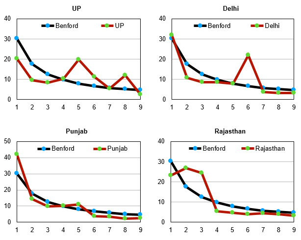
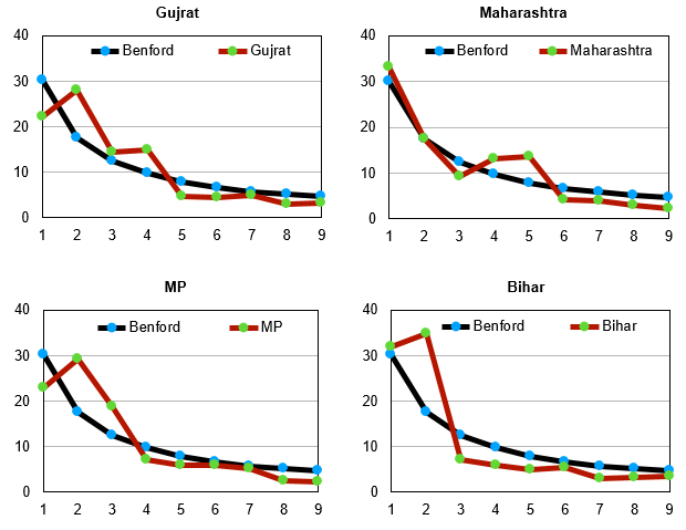
Henceforth we are examining statewide data for India and have merged — for each graph — the data for daily infections, daily deaths and daily recoveries. Thus, if the graph shows deviations from Benford’s Law, the implication will be that at least one of the three recordings of data categories has errors in it. But if this combined data curve fits Benford’s curve, then the inference is that all three sets of data are reliable. Merging the data points for the three categories helps bring greater clarity to the verification.
Also read: Don’t reduce the debate to ‘Modi is a Fascist’ level. India needs better critique of populism
The India data
When it comes to India, the data for the entire nation has some issues but in general there is a passable fit. We must clarify that this indicates inaccuracy of data but does not necessarily indicate fraudulent recording. However, in general, when it comes to accuracy of data in India — for any kind of data — invariably issues and concerns arise. The sooner India learns the art and science of accurate data keeping the better it shall be for the nation.
Kerala’s data is quite reliable as it fits Benford’s curve quite nicely. Punjab also has fairly accurate data indicated by a very good fit between the Benford curve and the curve for its data. The biggest offenders seem to be Haryana and Uttar Pradesh. The curves for these two states are quite off the mark as can be seen by their graphs. Rajasthan and West Bengal are also not very encouraging. However, the one redeeming feature for so many of these states is the fact that several of their data points do seem to be in conformity with the Benford’s curve. This ultimately helps keep India’s curve in reasonable conformity with Benford’s curve. We leave the question of whether any of this data is fudged to the reader but certainly much of the statewide data is unreliable.
Dinesh Singh is former Vice Chancellor, Delhi University and Adjunct Professor of Mathematics, University of Houston. Ajay Kumar is Assistant Professor of Mathematics,
K. R. Mangalam University, Gurugram. Views are personal.
(Edited by Anurag Chaubey)